Upgrading the banking experience.
Bankinter / Fintech / B2C

At Finhelp, we realised that improving a bank’s existing app often makes more sense than building a new super app from scratch. So, we focused on redesigning our clients' main banking app, using data-driven insights to enhance key functionalities and create a better user experience.
The basics —
Understanding what are users doing.
We started by analysing usage data, revealing that over 70% of customers primarily use the app for checking balances and transactions and making money transfers. To gain deeper insights, we conducted user tests and focus groups, identifying key pain points in existing processes and uncovering interesting user workarounds that shaped how they interacted with the app.

Based on our initial research, we identified 3 key areas to prioritise and make exceptional:
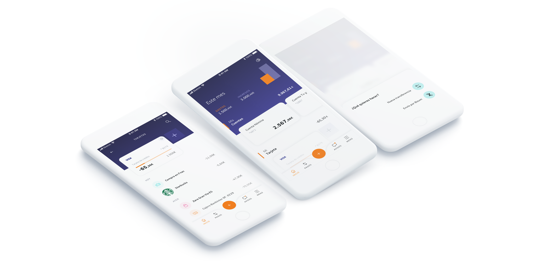
Home Banking: Designed a clear, intuitive dashboard displaying essential account information at a glance.
Mobile Payments & Transfers: Completely redefined the money transfer process, making it faster and more seamless.
Notification System: Reimagined alerts to ensure users are instantly informed of important events and can respond quickly when needed.
The idea —
Making money management effortless.
As the landing screen for all users, the home dashboard needed to present financial information clearly and instantly. Our goal was to ensure users could grasp their financial status at a glance.
To achieve this, we:
Introduced a new header section featuring a graphical summary of income and expenses, with direct access to the Personal Financial Management for more detailed insights.
Retained the carousel and product list system, as it had proven successful in the previous version and was highly valued by users.
Integrated a smart contextual multifunction button within the tab bar—this button adapts to user behaviour, always surfacing the most frequently used action for each section. This keeps users focused by ensuring their most common operations are easily accessible without disrupting the reading of their financial data.
Simplicity Meets Flexibility.
After exploring countless design inspirations, we realised that a money transfer process is more complex than it seems. While most transactions are straightforward, there are many edge cases that need to be accounted for to create a truly inclusive and seamless experience.
With this in mind, we redesigned the transfer flow to be adaptive and dynamic:
A new contact and favourites system allows users to quickly access frequent transactions and send money to their trusted contacts with fewer security barriers—making the process faster, smarter, and friction-free.
Invisible background calls now fetch real-time data, ensuring that additional steps or complexity only appear when necessary.

Alerting users when it matters.
We worked hard to design a smart, non-intrusive notification system. One that respects users' time while ensuring they are alerted only when something important happens.
In collaboration with the data team, we developed a set of intelligent rules, which received highly positive feedback in user testing.
Additionally, we integrated push notifications across multiple processes, incorporating:
Automatic OTP reading, eliminating extra steps for users.
Deep-linking, guiding users directly to relevant actions.
These enhancements save time, reduce friction, and align with our core mission: making banking fast, intuitive, and effortless.

The devil is in the details.
As we transitioned from a web-view-based application to native technology, we saw an opportunity to elevate the user experience by fully utilising the benefits of a native environment. Our goal was to create an app that users enjoy using and want to return to again and again.
To achieve this, we carefully redesigned key interactions, including:
Navigation, ensuring a seamless and intuitive flow.
Detail views, optimising readability and accessibility.
Search functionality, making it faster and more efficient.
By refining these essential areas, we created a more fluid, responsive, and engaging experience, making the most of what native technology has to offer.

We paid extreme attention to every aspect of design and usability, ensuring the app felt intuitive, responsive, and engaging. This meant going beyond aesthetics to enhance how users interact with the product at every touchpoint.
Key improvements included:
Haptic feedback in toast notifications, adding a tactile dimension to interactions.
Thoughtfully designed animations, not just for beauty, but to help users stay oriented as they navigate between screens and processes.
A new Modular Visual System, providing clear, pleasant feedback that improves usability without overwhelming the interface.

Lessons Learned —
A harder job than expected.
After nearly two years of development, we launched the final version in October 2019. The migration to native technology and a complete system architecture overhaul made the final phases of the project particularly challenging.
Despite these complexities, the app has been live in Friends & Family mode and small control groups for over a year, gathering highly positive feedback. We are confident that this reception will extend to our customers and the general public, making all the hard work truly worthwhile.
— Previous Project
Next Project —